Tone
This could be one of the most important if not the most important design element of any painting, because tonal values helps give an overall feel of depth and form to whatever subject matter/object in a drawing or painting. Grey-scale tonal value refers to the intensities of grey, from a very dark(almost black) to very pale grey then white. So the correct use of tone not only makes our brain recognize a 2D drawing as 3D dimensional but it also makes an object look more interesting
Colour Theory
With colours you can set a mood, attract attention, show energy, or to cool down a piece of imagery. Colour is another important design element, because they affect us in numerous ways, both mentally and physically.
The colour wheel is your basic tool for combining colours. It is broken up into three colour catogaries, primary, secondary and tertiary colours. Primary colours cannot be made by mixing, they form the foundation of the wheel. By combining these colours you are able to create secondary colours. These colours are Blue, Red and Yellow. A secondary colour is made by mixing two primary colours for example red + blue makes Purple(violet), Red + Yellow makes Orange and Yellow + Blue makes green. Another six tertiary colours are then created by mixing primary and secondary and they form the colours in-between.
Complemantary colours
Colours that are oppisite each other on the colour wheel are considered complementary colours (for example red and green). Complementary colours are good to create high contrast and vivid/vibrant imagery. Although using a complementary colour scheme is difficult to use in design because your outcome may seem a little jarring.
Analogous colours
Analogous colours are three colours that are adjascent on the colour wheel. Put together in a design they match well and create nice/serene images. The analogous colour scheme is often used in nature and is considered to create harmony in images.
Warm and Cool colours
The colour wheel can be divided into warm and cool colours.
Warm colours are vivid and energetic and tend to advance in space
Cool colours create an impression of calm and is soothing
Hue
Hue is the term that describes the distinct characteristics or colour property of a colour. In painting it is how much red, blue, yellow, green colour pigments are seen in a paint base. And because colour is a phenomenon of light it is largely dependant on light that is reflected on an object.
Saturation
Saturation is the intensity or strength of a colour with respects of its lightness or "values". This basically means that colour saturation is the degree that it is defferent to grey at any given lightness.
Value
The value of colour is based on the amount of light eminating from a colour. the easiest way to visualize this is to remember the greyscale, which runs from white to black. The brighter the colour is, the higher its value. So a Royal purple/blue is typically less in value and emits less light that a sky blue which is higher in value.
Tints, shade and monochrome.
Colours that are mixed with white and black can become a shade or tint. These terms are often used incorrectly. By adding white to a pure hue it becomes a tint colour. And likewise if we add black to a pure hue it becomes a shade of that colour. And if we were to add grey the result is a different tone. Now creating a colour range from a single base hue and making it gradually lighter or darker, using its shades and tones is called a monochromatic colour scheme or range. Monochromatic colour schemes are considered boring because it is essentially one colour but using a monchromatic range can be useful for applying subtle colours of a single hue.
Perspective
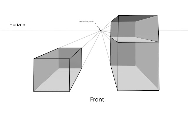
Drawing using perspective and getting it right should be a fundemental in your artwork and is soo easy to accomplish if you follow the right rules and guidelines. There are many types of perspective, one point, two point, three point and even zero point perspective. But basically the rule of thumb in getting your perspective right in an image is to literally visualize where the vanishing points are and follow it and practice it. By drawing lines that fit with the geometry set by these guidelines created from the vanishing point, your object, road, building is going to look right and in perspective. Here are a few diagrams that should hopefully display the rule of perspective for your veiwing.
Above you can see that there is a horizon, front and vanishing point. The horizon is ussually eyelevel with your eyesight. That is why the box is below eyelevel and you are able to draw in the roof or ceiling of the box. The box on the right however has an extended section that has risen above the horizon point, hence it is to tall to see the roof and so the veiwer only see's two sides, front and side. This rule can and should be applied to landscape designs, interior designs, vehicle designs but this rule is strictly only for subjects in a frontal veiw perspective.
Here is an example of two point perspective. The differenece here is that you are veiwing the object from the corner and there are two vainishing points, one on the left and one on the right.
Here is an example for three point perspective, you can see that there are 3 vanishing points. This method is good for when you are drawing a massive cityscape from an aerial perspective.
Rule of thirds
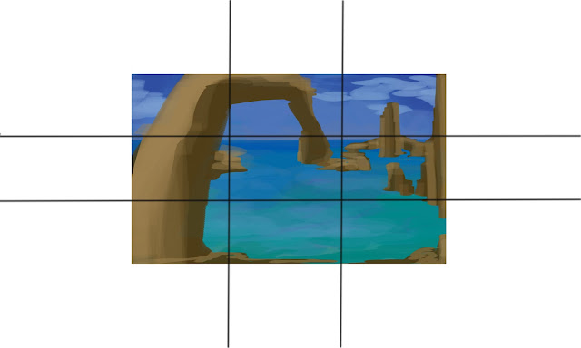
The rule of thirds is another guideline mostly used in photgraphy but artist should recognize this rule for good composition within their paintings. The rule proposes that an image should be divided into 9 equal parts by 2 equally space horizontal lines across the image and 2 equally spaced vertical lines. Now using these guidelines the artist should place important compositional elements along these lines or the intersections where the lines meet. By using the rule of thirds and aligning a subject with thee points, it attracts the veiwer to these points, more so than simply centering the subject in the middle of the grid.
Here I have divided my landscape using the rule of thirds and will tell you how it works a little. One of the major points about using the rule of thirds is that the photographer/ artist should align the horizon roughly along one of the two horizontal lines this creates appropriate spacing for the foreground or background. And if I were to draw in a boat in this landscape I would place it on the lower horizontal line where it is meeting either one of the vertical lines. And if i were to draw in a person looking directly at the veiwer standing in the foreground, I would place him on one of the vertical lines with his eyes aligned to the upper intersection points.
Fibonacci Spiral
Similar to the guidlines of the rule of thirds the fabonacci spiral is a logorithmic spiral that comes from one corner of your image and spirals in to a focus point. So similarly with the rule of thirds as an artist you need to align components around this spiral, focusing your subject where the spiral ends...I actually drew in a boat this time to show you.
See how I positioned the boat in the spiral...I also drew in red lines to show how perspective can lead the eye coming from the overhead rockface on the left, around, then back down towards the boat or back to the start.


No comments:
Post a Comment